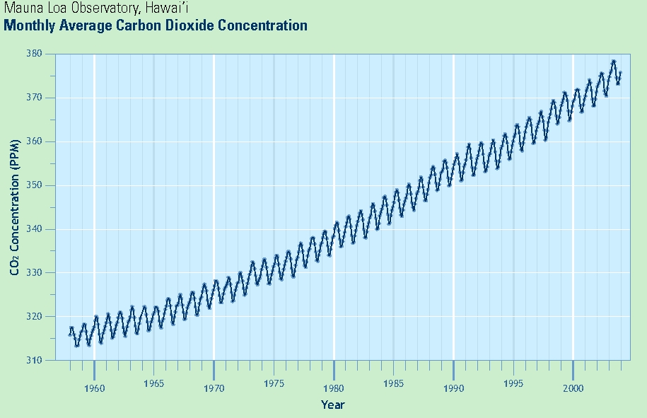
In this exploration you will use slopes of lines to estimate the average rate of change — here, an average rate of increase — of some quantity (in this case, average atmospheric concentrations of CO2 near the Manua Loa Observatory (MLO)) during a time interval.
I. Slopes: Visual/Graphical Approach
- Using a pencil, mark a point on the graph above the year 1960 at a "middle height" location amidst the zig-zagging line, not at the top nor at the bottom (in particular, it's ok if your point is not exactly on the zig-zagging line itself). Call this point A. Do the same for 1970, 1980, 1990, and 2000 (points B, C, D, and E, respectively).
- Use a ruler (or another object which can serve as a sufficiently-long straightedge) to draw the line segment between points A and B, and then to carefully continue that line to the right until it reaches the right edge of the above image.
- Do the same for the line segment between B and C, likewise continuing it to the right (stop at this point; do not use D and E).
- Summarize below in a clear, precise, full-English sentences a
"regular member of the public" could understand, what, in broad terms
these lines indicate about CO2 and rates of change. Be precise!
__________________________________________________________________________________________
__________________________________________________________________________________________
__________________________________________________________________________________________
- Numerical estimates using the graphical approach.
Devise a strategy for approximating the slopes of drawn line
segments on a graph such as this (hint: think back to "rise over run"
and draw some vertical and horizontal lines through points A,
B, and C until you find their approximate x- and y-coordinates; use
these to est. "rise" and "run")
- Estimate the slope of the line segment from A to B: ______ Estimate the slope of the line segment from B to C: ______
- What are the units for these quantities? ______per _____.
- Estimate the rate of increase of CO2 during the 2000-2005 period: ______ ppm/yr.
II. Slopes: Numerical Approach
The fuller data from the Carbon Dioxide Information Analysis Center
(cdiac.ornl.gov) at the Oak Ridge National Laboratory —
the primary climate-change data and information analysis center of the
U.S. Department of Energy (DOE) — is found on the 3rd page.
__________________________________________________________________________________________
__________________________________________________________________________________________
__________________________________________________________________________________________
__________________________________________________________________________________________
__________________________________________________________________________________________
__________________________________________________________________________________________
__________________________________________________________________________________________
III.Using Tables: A Second Look
__________________________________________________________________________________________
__________________________________________________________________________________________
Now use the data for each year (using the right-most "Annual-fit"
column) to fill out the following table:
__________________________________________________________________________________________
__________________________________________________________________________________________
__________________________________________________________________________________________
__________________________________________________________________________________________
Year
(Fit) Avg. Annual CO2 level
1960
1970
1980
1990
2000
Time period
Change in Avg CO2 per decade
1960 to 1970
1970 to 1980
1980 to 1990
1990 to 2000

Year
(Fit) Avg. Annual CO2 level
1963
1973
1983
1993
2003
Time period
Change in Avg CO2 per decade
1963 to 1973
1973 to 1983
1983 to 1993
1993 to 2003